You have seen it happen. A photograph looks flawless on your phone. Every eyelash is separated, the grain in the wood is crisp, the text on a distant sign is legible. You send it off to a print lab, and what comes back is soft, mushy, and vaguely disappointing.
Nothing went wrong in transit. The file did not degrade. What changed is the measuring system.
Screens and paper do not share a vocabulary for sharpness. Screens are measured in Pixels Per Inch (PPI), a count of discrete light-emitting elements packed into a linear inch of glass. Paper is measured in Dots Per Inch (DPI), a count of ink droplets a printer can lay down across that same inch.
These sound like the same idea wearing different hats, but they describe fundamentally different physical processes. One pixel can be any color at any brightness. One ink dot is a fixed color, either present or absent.
The gap between those two systems is where most print disappointment lives. Understanding the physics and the arithmetic behind perceived resolution is the only reliable way to predict what a screen image will look like once it exists as a physical object.
The Digital Standard: Decoding “Retina” and PPI
When Apple introduced the term Retina in 2010, it was not describing a specific pixel count. It was describing a relationship. The claim was that at a typical viewing distance, individual pixels would fall below the resolving power of the human eye and disappear into a continuous image.
That idea is called angular resolution, and it is the single most useful concept in this entire discussion. What matters is not how many pixels exist per inch, but how many pixels land on a given slice of your field of view.
A 326 PPI phone held at twelve inches and a 51 PPI television viewed from nine feet can deliver nearly identical apparent sharpness, because the eye does not measure inches. It measures angles.
Modern hardware has pushed well past the original benchmark. A 14-inch laptop panel now typically lands around 250 PPI. Flagship smartphones routinely exceed 450 PPI, with some pushing toward 500. Whether any of that is visible is debatable, and that debate is exactly the point: past a certain density, additional pixels stop contributing to perceived detail and start contributing only to battery drain.
There is also a perceptual thumb on the scale. Displays emit light rather than reflect it, and emitted light behaves differently in the visual system. An OLED panel with near-infinite contrast produces edges where a bright pixel sits directly against a genuinely black one.
That abrupt luminance transition reads to the brain as acutance, the subjective sense of edge crispness, which is not the same thing as resolution. High dynamic range (HDR) amplifies the effect further.
A specular highlight rendered at 1,000 nits next to deep shadow detail creates an impression of clarity that no printed page can replicate, regardless of dot density. Part of what you admire on screen is contrast masquerading as detail.
The Physical Standard: The 300 DPI Rule
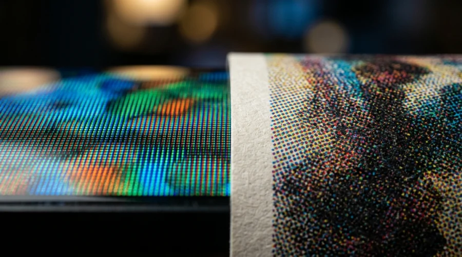
Printing works by an entirely different mechanism. A press or inkjet cannot produce a continuous-tone pixel. It has a small set of inks, typically CMYK, and it must simulate every other color and every intermediate brightness by arranging tiny droplets in patterns your eye blends together at normal distance.
This process is called halftoning. To render a medium gray, the printer places black dots at a spacing that leaves the right proportion of white paper showing. To render a muted teal, it interleaves cyan and yellow droplets with a scattering of black.
Because several dots are required to describe the tonal value of a single image pixel, printing demands considerably more dots than the image has pixels.
That is why a 300 DPI file might be output on a device rated at 1440 or 2880 DPI. Those numbers are not measuring the same thing, and confusing them is a common source of panic.
The 300 DPI figure is where this becomes concrete for most people. It is the number that appears the moment a digital creator decides to move work offline.
Anyone transitioning a digital gallery into quality photobooks discovers quickly that 300 DPI is the strict threshold high-end printing services demand, because below it the halftone structure can no longer hide the underlying pixel grid, and edges begin to show visible stair-stepping.
Then there is the light itself. Paper has no backlight. Every photon reaching your eye from a print has bounced off the sheet first, losing energy and picking up the color cast of whatever room you are standing in. Maximum black on premium paper reflects a few percent of incident light, giving a contrast ratio in the low hundreds to one.
An OLED panel is effectively unbounded. Stripped of that contrast advantage, a print has only one tool left for conveying sharpness: dense, precise, physical dot placement. Ambient lighting does the rest, and poor lighting will make a technically perfect print look flat.
The Math: Translating Screen Pixels to Physical Inches
The formula is refreshingly simple. Divide pixel dimensions by target DPI to get inches.
Take a 4K image at 3840 x 2160 pixels. Divide each dimension by 300:
- 3840 ÷ 300 = 12.8 inches
- 2160 ÷ 300 = 7.2 inches
That file, which fills an entire 65-inch television convincingly, yields a pristine print roughly the size of a sheet of letter paper. Nothing was lost. The pixels were simply always going to occupy that much physical space once bound to a 300 DPI grid.
Run it in reverse to size your files. A 16 x 20 inch print needs 4800 x 6000 pixels, or 28.8 megapixels. A modest 8 x 10 needs 2400 x 3000 pixels, well within reach of most cameras.
This is also where upscaling earns its bad reputation in print circles. Neural upscaling on a television is genuinely impressive, because motion provides cover. Each frame persists for about sixteen milliseconds, temporal information from surrounding frames helps the algorithm make better guesses, and your eye integrates the result.
A print offers none of that. It is one static frame under indefinite inspection. Invented texture that reads as plausible foliage in motion reveals itself as smeared, repetitive, oddly plastic detail when someone leans in with a coffee. Upscaling can rescue a file that is modestly short of target. It cannot manufacture information that was never captured.
The Biological Factor: Viewing Distance
The concept that reconciles both worlds is Pixels Per Degree (PPD), the count of image elements falling within one degree of your visual field. At any given distance, one degree subtends roughly 1.75 percent of that distance. Human visual acuity tops out near 60 PPD for most observers under good lighting.
Work the numbers and the symmetry is striking. A 460 PPI phone at twelve inches delivers about 96 PPD. An 85-inch 4K television viewed from nine feet delivers about 98 PPD. A 300 DPI print held at reading distance delivers about 63 PPD, sitting just above the acuity threshold.
The 300 DPI standard is not arbitrary tradition. It is the point at which dots vanish at the distance books and photographs are actually held.
This explains the billboard effect. That 85-inch television is only about 52 PPI, a density that would look catastrophically coarse on a desk. Distance rescues it. But print that same 74 x 42 inch image at 300 DPI and you would need roughly 22,000 x 12,500 pixels, about 280 megapixels, which is more than ten times what a high-end full-frame camera captures.
Billboards sidestep this entirely by printing at 15 to 30 DPI, because nobody inspects them from three feet.
Practical viewing distance should therefore drive every decision. Smartphones and books sit at 10 to 15 inches and demand the highest densities. Desktop monitors sit at 24 to 30 inches, where roughly 160 PPI already reaches the acuity limit.
Gallery prints viewed from several feet tolerate 180 to 240 DPI without visible penalty, which quietly rescues a great many files that fail the 300 DPI test on paper but pass it in the room.
Conclusion & Best Practices
Screens and paper speak different languages. One emits light and leans on contrast to sell sharpness; the other reflects light and relies entirely on dot density. Translating between them means knowing both your display’s pixel density and your printer’s requirements, then letting viewing distance arbitrate.
A short checklist before you commit to a print run:
- Inspect every file at 100 percent zoom. Anything below that ratio is your display interpolating, and interpolation hides the softness you are trying to detect.
- Run soft-proofing with your lab’s ICC profile and a paper-appropriate rendering intent. Expect saturated blues and deep shadows to compress.
- Divide pixel dimensions by 300 first and let the arithmetic set your maximum size before you fall in love with a larger one.
- Adjust the target down to 200 DPI for large work meant to be viewed from a distance. For anything held in the hand, keep it at 300 DPI and don’t drop below that.
- Sharpen for output as the final step, after resizing, and sharpen more aggressively than looks correct on screen. Ink spreads slightly into paper fibers, softening fine detail. Because of this, prints usually need a touch more sharpening than the on-screen image seems to require.
- Evaluate the finished print under lighting that matches where it will hang. A print judged under cool office fluorescents will surprise you in a warm living room.
Read Next
Device Pixel Ratio (DPR): The Relationship Between CSS Pixels and Physical Pixels
HDR vs OLED – What Sets Them Apart?
HDR10 vs HDR400 vs HDR600 vs HDR1000: Choosing the Right HDR Standard
Gorilla Glass and Beyond: The Materials Behind Ultra-Tough Screens

HGiG Mode for HDR gaming: Explanation
OLED Pixel Refresh Explained: What It Is and Why Your TV Needs It
HDR10 vs HDR10+ in Gaming: What’s the Difference and Does It Matter?
HDR On or Off? How to Decide
Google TV vs Samsung Tizen: Which Smart TV Platform Is Right for You?
QHD vs. OLED: Resolution, Panel Tech, and What Actually Matters
HD vs 2K vs 4K: Understanding Display Resolutions
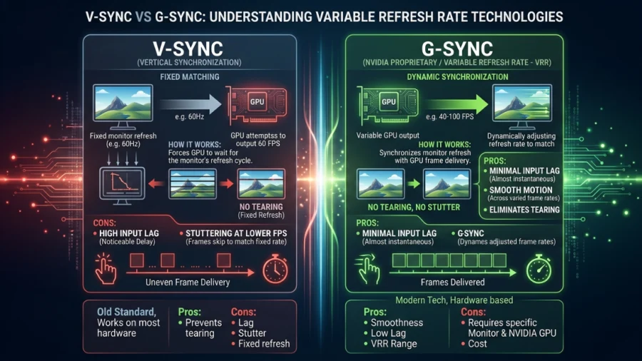
V-Sync vs G-Sync: Which Should You Use?
MSI Optix MAG342CQR Review: 1500R 1ms 3440×1440 144Hz; Curved UltraWide Gaming Experience