Introduction
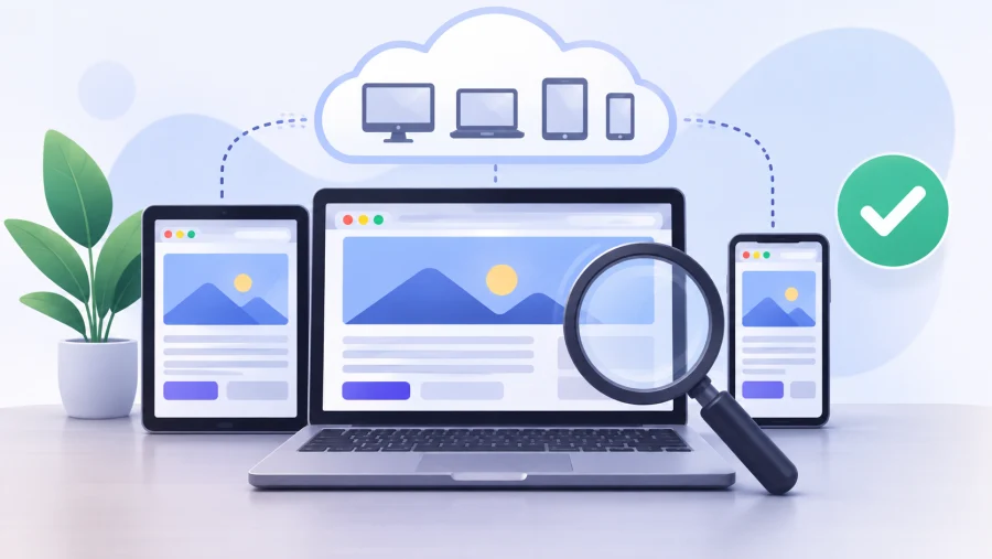
Testing the website across different screen sizes is extremely important before it reaches the production stage.
According to the major part of the analytics research, mobile devices are generating the major amount of the global traffic so how to test a project without actually owning a bunch of devices.
The good news is that you can check how your website looks on any screen size using just your own computer.
Insights into the importance of responsive design testing
The key recommendation for testing your project on various screen sizes is to do it locally. When all the checks are done on your machine, there is no need to physically own every device and manually test the responsiveness of the website.
By following such a strategy, you are wasting fewer resources and finishing all the tasks faster.
Once the proper testing is conducted, you can be sure that all the users will get a better user experience, and there won’t be any random bouncing from your resource. Issues with functionality can detrimentally impact the business reputation and revenue.
One more benefit of proper testing is earlier bug detection. When trouble is identified locally during testing, the fixing can take just a couple of minutes. However, when a website is already released, such risks can cost a lot more.
Proper functioning of your mobile version also positively impacts ranking in the search engines. For instance, Google starts indexing from the mobile versions first, so proper functioning directly impacts your ranking in Google.
Accessibility is part of this as well. Readable text, buttons that are easy to reach, and sensible zoom behavior help people with different needs and different devices to use your website comfortably.
Most common methods of testing without actually owning a device
Testing your project on the real device can be the most accurate method, but hardly anybody is using it for such a range of devices. The simplest and most affordable method is, of course, emulation and quick testing. So, let’s review the most commonly used options.
Free and built-in testing in Chrome
The process of testing in Google Chrome is fairly simple; just open the website that you want to test. Then right-click on the webpage, press “Inspect” and click the device toolbar icon. There are plenty of devices that you can select from: MacBook Air, various Laptops, Moto G4, Galaxy S5, Pixel 2, and plenty of other mobile devices.
If you have not found the appropriate device in the list, you can also add a custom screen size by pressing “Edit” at the end of the list. This variant of testing can be a great choice for most of the newly launched projects that require immediate testing.
Chrome’s device mode offers more than just resizing the viewport. You can rotate the screen to check both landscape and portrait orientation, switch between the responsive mode and fixed device presets, and throttle the network speed to see how the page loads on a slow mobile connection.
It also simulates touch input and different pixel ratios, so you can notice blurry images or buttons that are too small to tap. Firefox and Edge include similar tools, and it is worth running a quick check in each of them.
Online testing of the responsive design
Among other free options for testing, you can select other helpful tools that don’t require installation. The process is fairly simple: just insert the URL for testing and check it at various screen sizes. Among the most popular variants, we can specify:
- Viewport Inspector. This tool only gives a basic preview of the desktop, tablet, and mobile versions with no detailed specifications. Immediate overview of the design of various devices is a huge benefit so that an issue can be immediately identified. However, there are no deep technical specifications and details; it only offers a basic visual preview.
- Responsive Breakpoint Checker. This tool also helps with testing the URL with various screen sizes so you can get a better understanding of how it can look. This guarantees more detailed options and can help with the identification of layout issues that happen between the standard device sizes.
- Aspect Ratio Generator. This variant helps with the calculation of aspect ratios of video and image materials. With this option, it is possible to determine the most appropriate proportion of videos, images, or other visual assets.
Here we have mentioned free tools for checking the basic characteristics. However, if you are searching for more options and want higher accuracy in relation to every specific device, there are plenty of services that offer such assistance. Depending on the chosen service, the price might vary.
Testing on a real device when it matters
Emulators are great for layout checks, but they cannot reproduce everything. Real hardware can behave differently with touch gestures, font rendering, and browser quirks, especially in iOS Safari.
You do not need to buy every phone, though. Ask friends, family, or colleagues to open the website on their devices, or use a cloud testing platform that gives you remote access to real phones and tablets for a small fee.
If you want to open the project on your own phone during development, put it on a staging server or a test hosting environment with a private URL. This way you can check the website from any device on any network, not only from the computer where it was built.
A fast VPS Sweden or any other hosting that covers your project’s requirements will do the job, and it takes only a few minutes to set up a test environment there.
What should be checked during testing?
Once you have a couple of tools that you can effectively use for the testing process, you should clearly understand what the main issues that should definitely be checked are.
First, ensure that all media elements scale correctly across different screen sizes without becoming stretched or overflowing their containers. Text readability should also be a top priority, so make sure all content remains clear and easy to read on every device. Finally, check navigation responsiveness to ensure that menus function properly and remain easily accessible across all screen sizes.
Among other basic factors, we can specify proper image orientation, tap-target spacing, and breakpoints, and media queries.
Speed is another thing that people often forget. A page that loads fast on office Wi-Fi can feel painfully slow on a mobile network, especially when large images or heavy scripts are involved. Use network throttling and check that images are compressed and that nothing important is waiting for a big file to download.
Finally, test the common breakpoints. A good starting point is around 360 to 480 pixels for phones, 768 pixels for tablets, 1024 pixels for small laptops, and 1280 pixels or more for desktop screens. Also drag the browser window slowly from narrow to wide, because layouts often break between these standard sizes rather than exactly at them.
To conclude, testing across screen sizes doesn’t require owning every device. Combine your browser’s built-in tools with a few online checkers, confirm the important pages on a real phone, and review the basics: scaling media, readable text, easy navigation, and comfortable tap targets. Catching these issues before launch saves time and money, and it gives every visitor a smooth experience on any screen.
Read Next
QHD vs. OLED: Resolution, Panel Tech, and What Actually Matters
AMOLED vs OLED Explained: What the Labels Mean When Buying a Phone or TV

Asus TUF Gaming VG289Q1A Review: A Budget-Friendly 4K Monitor for Gamers and Content Creators
What is My Screen Resolution

HDR vs OLED – What Sets Them Apart?

HD vs 2K vs 4K: Understanding Display Resolutions

GTG vs MPRT: Display Response Times Explained

PHOLED vs OLED: Understanding the Differences and Advantages

HDR10 vs HDR400 vs HDR600 vs HDR1000: Choosing the Right HDR Standard

Mini LED vs OLED: Which Display Technology Reigns Supreme?

2K Resolution Size: Understanding the Midpoint Between HD and 4K
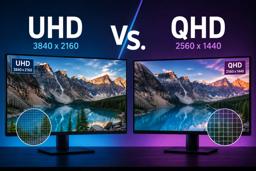
UHD vs. QHD: Which Resolution Is Right for You?
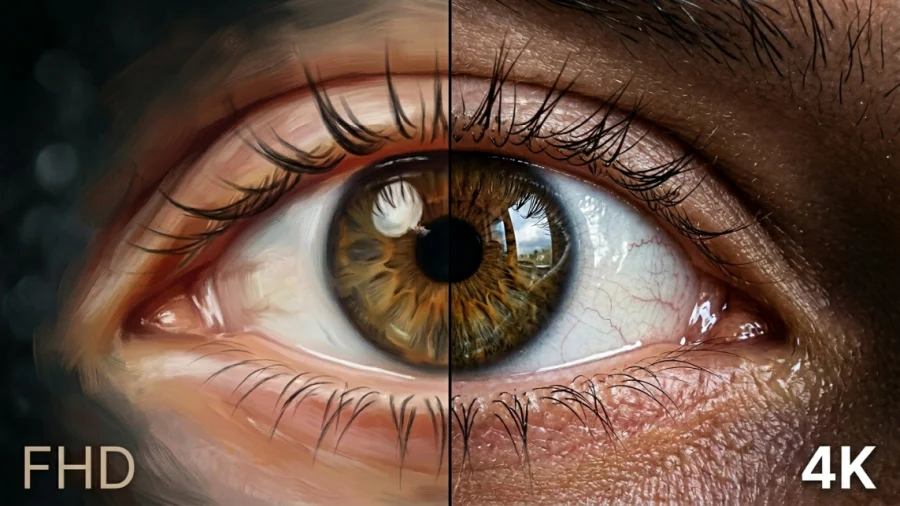
FHD vs 4K: Is the Upgrade Worth It?
